

I was approached by Artist Deirdre Murphy to create the catalog for her upcoming exhibition titled Nest Alchemy. I have admired Deirdre’s professional artwork for years, as she truly creates magical pieces that combine her skills in painting and printmaking, with her decades of interest in aviation migratory patterns and the effects of climate change.
I presented Deirdre with font and cover options for the vibe she wished to convey. Ultimately selecting a modern, sans-serif titled BC Novatica for headings, and a more subtle and neutral sans-serif, Aktiv Grotesk, for body text and image captioning.
The cover image selection process is one we collaborated on and eventually settled on her image Heart Throb. After many rounds of experimenting with text color and a transparent color swath behind text, I abandoned that idea once I was granted creative liberties, as I saw potential to mess with how the font could intertwine with the branches extending from the nest below.

Another aspect of creating this project that I enjoyed was the freedom I was allowed in manipulating the scans of her artwork to allow for text inclusion or interaction. The cover, interior cover, and acknowledgements page all are evidence of that.
I was lucky enough to get advice from other professors in the design department, including Professor Maurizio Masi, who gave me an unbelievably amount of help. Fresh design eyes were exactly what I needed to finish this project strong and do Deirdre’s work justice. He pushed me to think creatively, to blow up her images and step beyond typical pages of images centered evenly. Additionally, we considered the rhythm the book will have and what elements were truly necessary. Below are images of that process of evaluating the work I had produced, though I’m happy to say my finished product looks very different.
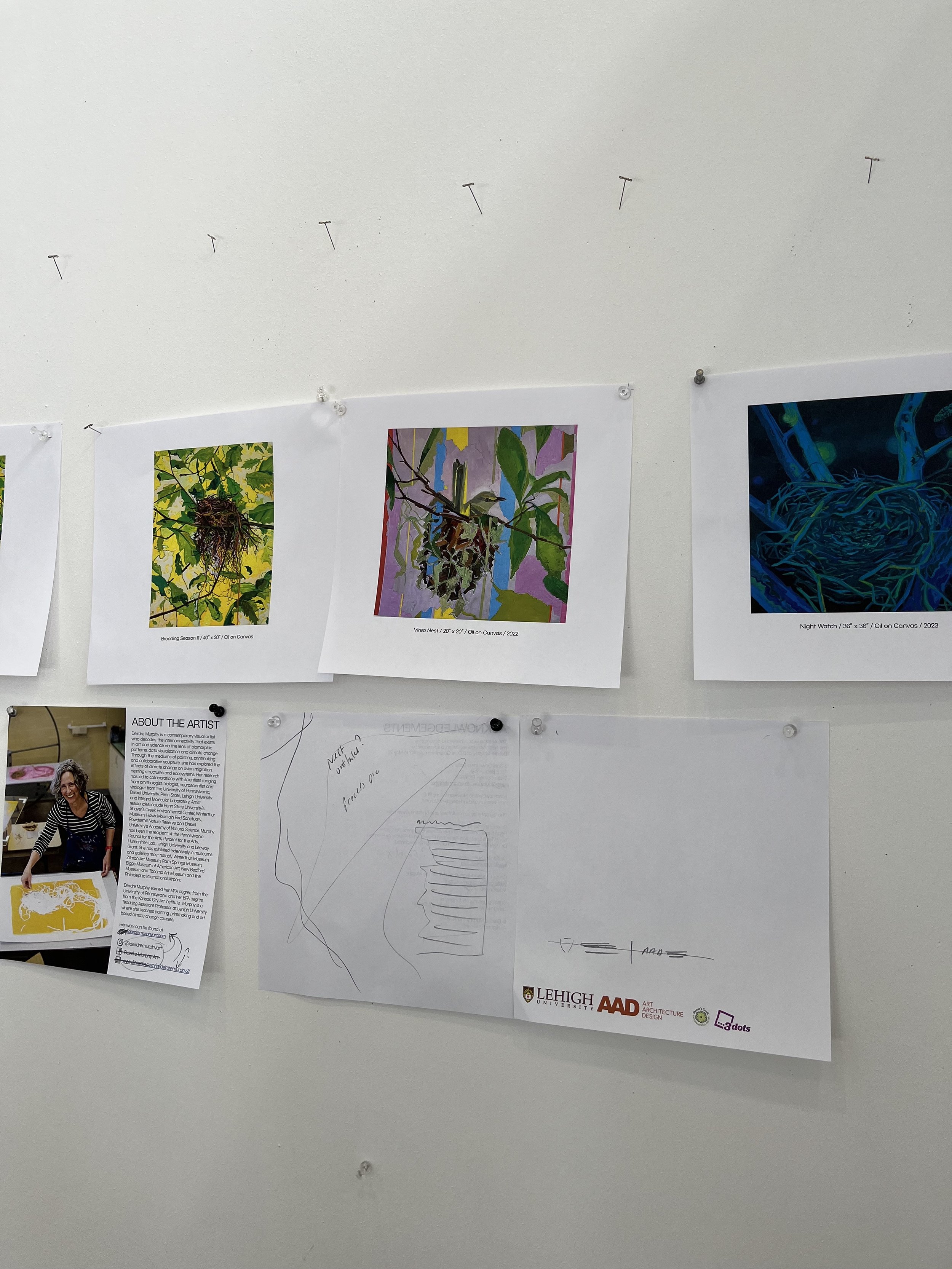

After continuously meeting with Deirdre to check in and make sure she was happy with the progress and okay with the less-than-ordinary angle I was intending to take on her catalog, I am thrilled with the finished catalog and she is even more so. Below you’ll find the completed cover image, followed by each spread. The exhibition catalog consists of 24 pages and was printed with GSB Digital. Physical copies available on request but I encourage you to view by flipping through the images below or exploring an animated version on Issuu, accessible by clicking the button below.


