During the Fall 2022 semester, I took Design 253: Brand Experience. We were assigned a semester-long project of redesigning a museum’s logo and brand identity. I selected the Corning Museum of Glass, located in Corning, NY.
This is the museums’s current logo.
I found this image to be surprising for a museum centered around glass. Glass can be transparent and simple, but also highly decorative and unique. I agreed with their choice of a sans-serif which I think modernizes the museum, but I find the lack of color and creativity glaringly apparent. (No offense :)
I immediately was inspired by stained-glass windows which I think really emphasize the possibilities that glass holds. I knew I wanted something modern and clean but visually screams glass. The goal was a logo that would spur immediate recognition and become integral to the museum’s branding. I played around with the idea of overlapping initials to create the appearance of blended letters and colors. My first few drafts centered around these ideas. Below are images from initial stages in the creative process.


As you can see, I tried many fonts, case-variations, and color palettes before settling on my favorite combination.

I then developed items like membership pins, totes and more.


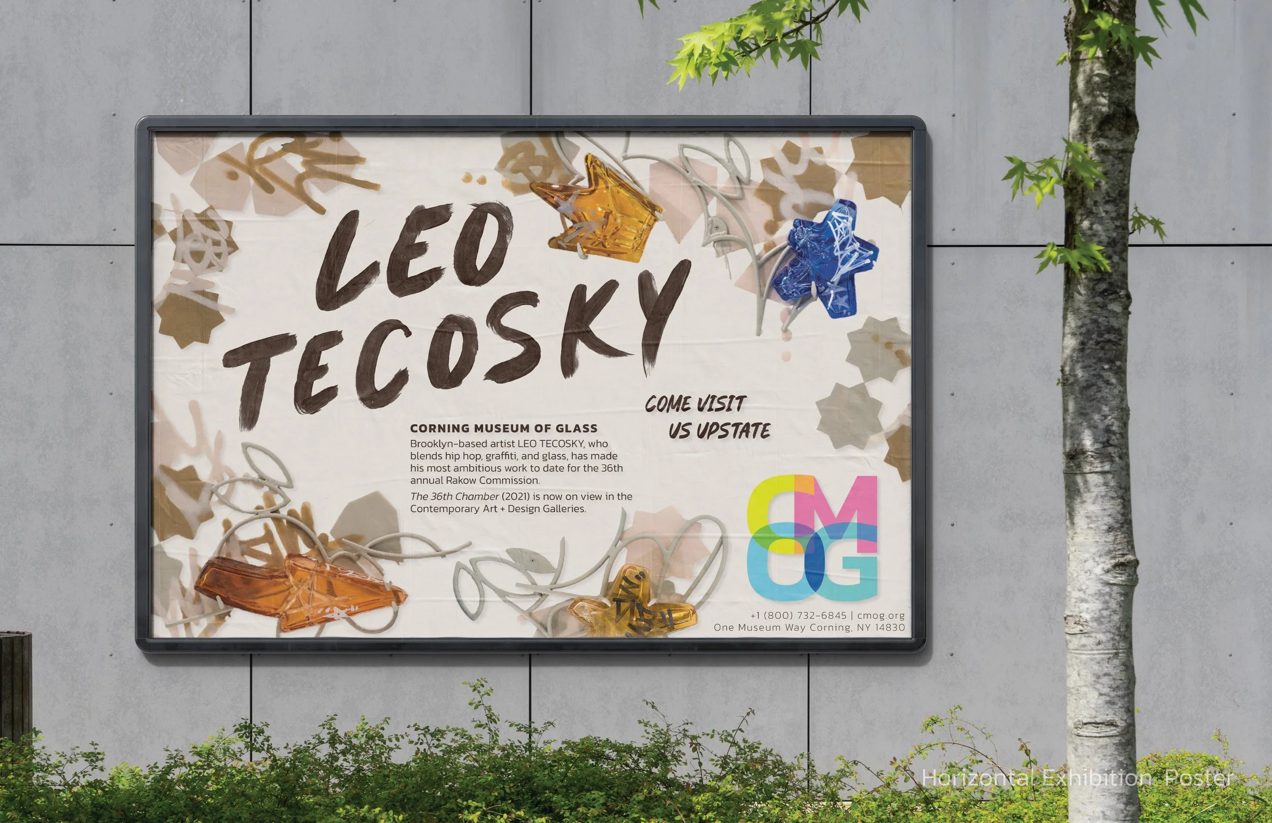
The next objective in the museum redesign project was to develop an exhibition poster for the specific museum. The Corning Museum of Glass has a special commission awarded each year to support an artist in the financial development in a new piece for the museum. In 2021, the Rakow Commission was awarded to Leo Tecosky, a Brooklyn-based artist who blends graffiti, steel, and most importantly, glass. The posters I created incorporated elements from his commissioned piece and a font I hand-painted, with the goal of seamlessly complimenting the vibe of his work.

Painted font

Image of the Rakow Commission by Leo Tecosky

Vertical poster

Horizontal poster
Finally, you’ll find mockup imagery for the Rakow Commission promotion, as well as pages from the brand guidelines below.