
Lyrical Printmaking
Throughout my time at Lehigh, I have thoroughly enjoyed my exploration into printmaking. I am participating in an independent study of sorts, creating more prints that I feel qualify as examples of design that can contribute to my portfolio, as opposed to the art pieces that are categorized under the Art section of this site.
I was prompted with creating a piece with text which requires a mirrored image so the writing may be legible. I was inspired by Kennedy Prints, who creates colorful, layered prints with strong black text as the final layer.

Designed Lyrics

Flipped Image
I began by designing the lyrics I’d chosen in Illustrator. This is something I feel very comfortable doing and it is quite enjoyable for me. The lyrics are from You’re on Your Own, Kid by Taylor Swift. I found the Bookmania font in black italic to be really fun since I could individually chose the letterforms I wanted to use in each word. For example, the N in reason has extra flair compared to the N in no. Once I was happy with my design, I flipped the image and printed it so it would read correctly in the final piece.
My next steps included color tests and choosing to hand-cut the lyrics out of a dura-lar sheet with an exacto. I chose to do this by hand as opposed to utilizing the laser cutter, as I really do enjoy the handmade quality and variation that I can get in the multiple versions of this print by doing it all by hand.
To the left is an example of my color testing. I use all water-based inks and needed to see how the pink would alter the appearance of the layers of orange and yellow on top.

My process consisted of pulling the pink rectangle for the background, two separate runs through the press with yellow, off-registered text, another two runs of the off-registered text in a brighter yellow, (this time with the addition of white to get more of a true yellow on top of pink, as opposed to the orange in the previous runs), then finally the centered text in black, which required I place the centers of letterforms to get the intended shape.

One of the yellow off-registrations
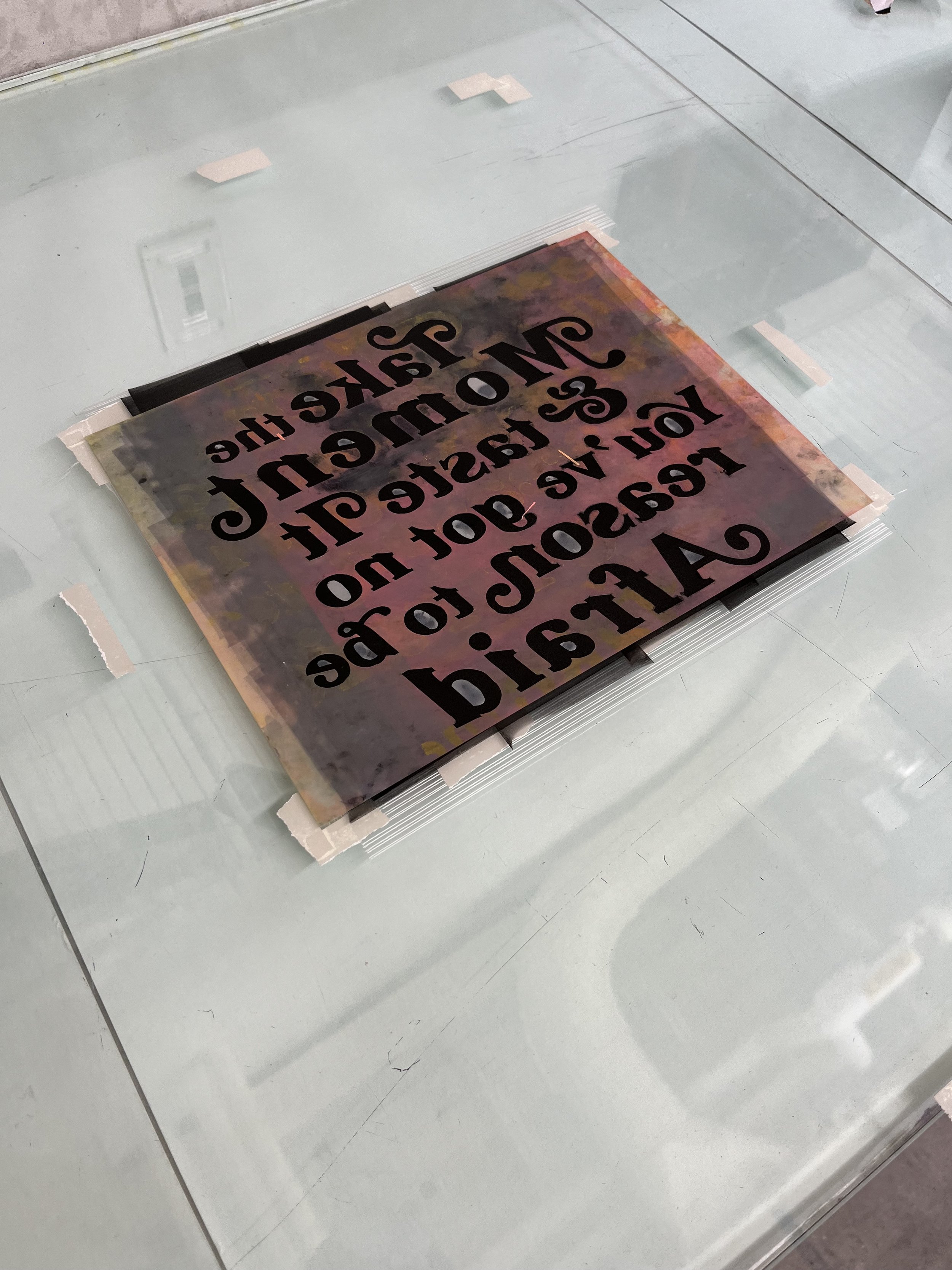
Dura-Lar stencil placed before printing

The very dirty stencil and its' teeny pieces
I have two final renditions of this piece. One with perfect registration on the edges, the other is perfectly imperfect, and I actually love how the smudging allows for the pure yellow to be seen in the bottom right corner. This project was a love-letter to printmaking while still being able to include my graphic skills. I’m really happy with how it turned out and I look forward to continuing to experiment at the intersection of design and printing.